Photo by Kiarra Magnus
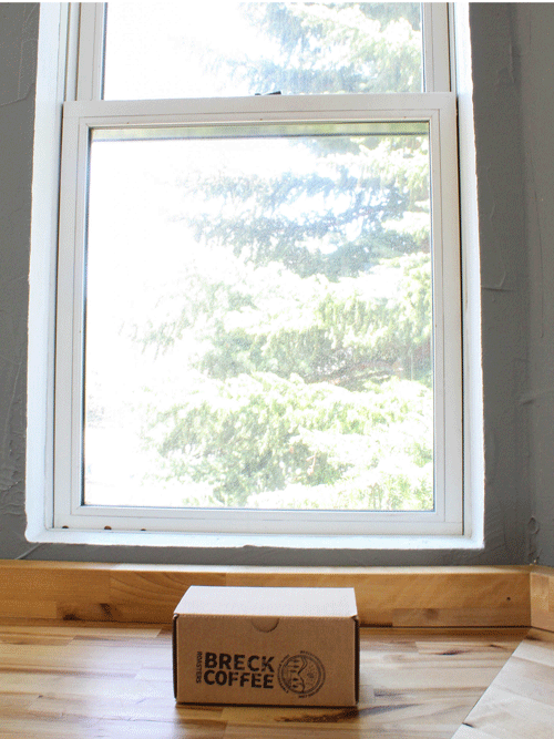
Breckenridge Coffee Roasters
LOCATION: Breckenridge, Colorado
PROJECT: Brand & Marketing Strategy
INDUSTRY: Specialty Coffee & Retail
PROJECT:
Brand Strategy & Positioning
Brand Voice, Tone & Messaging
Brand & Style Guide
Website Design & Build + Ecommerce
Marketing Collateral
Marketing Strategy
Product Line Strategy
Social Media Direction
Photography & Visual Guidance
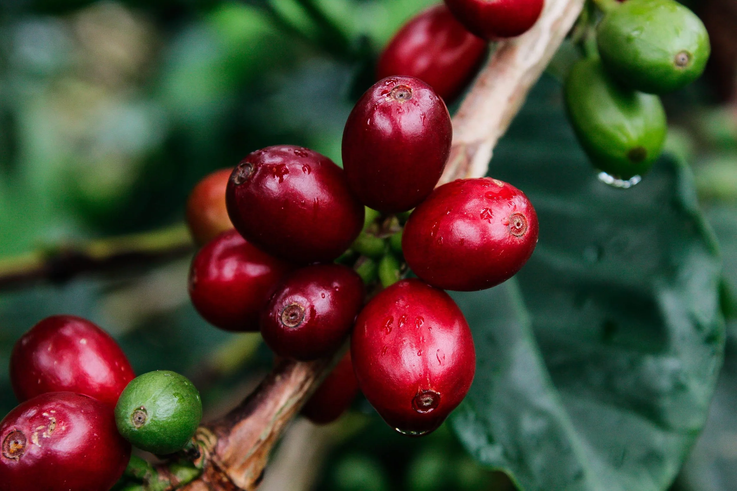
Photo by Kiarra Magnus
THE CHALLENGE
Breckenridge Coffee Roasters was founded by a few friends with a shared passion for sustainability and specialty coffee — roasting small-batch, high-quality beans at 9,600 feet in the Colorado Rockies. The coffee was exceptional. The brand, however, hadn't yet caught up to the quality of what was in the bag.
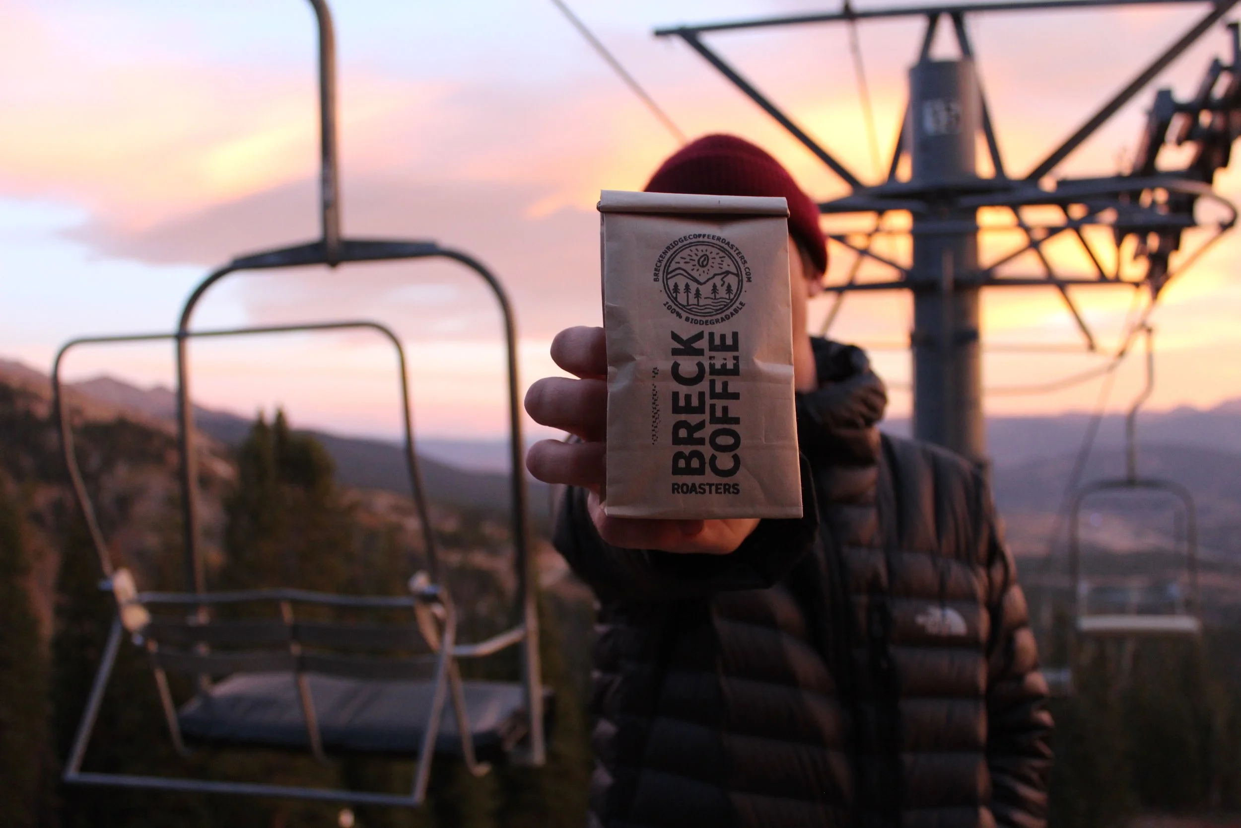
BCR needed a full brand foundation — a cohesive identity, a defined voice, and a strategic framework that could carry them from a beloved local roaster to a recognized name in the specialty coffee market. The challenge was to build something that felt authentic to Breckenridge life — adventurous, laid-back, eco-conscious, and deeply community-rooted — without veering into mountain-town cliché or the elitism that can shadow the specialty coffee world.
OUR APPROACH
This project was a true collaboration. BCR worked with a talented local designer to create the visual identity components — the logo system, color palette, and typography — resulting in a brand aesthetic unmistakably rooted in the community it serves.
Kiarra came in to take those visual building blocks and build everything around them. That meant developing the brand strategy, defining the voice and tone, writing the messaging framework, producing marketing collateral, building out the website, and creating the comprehensive brand and style guide that tied it all together into a system BCR could actually use and grow with.
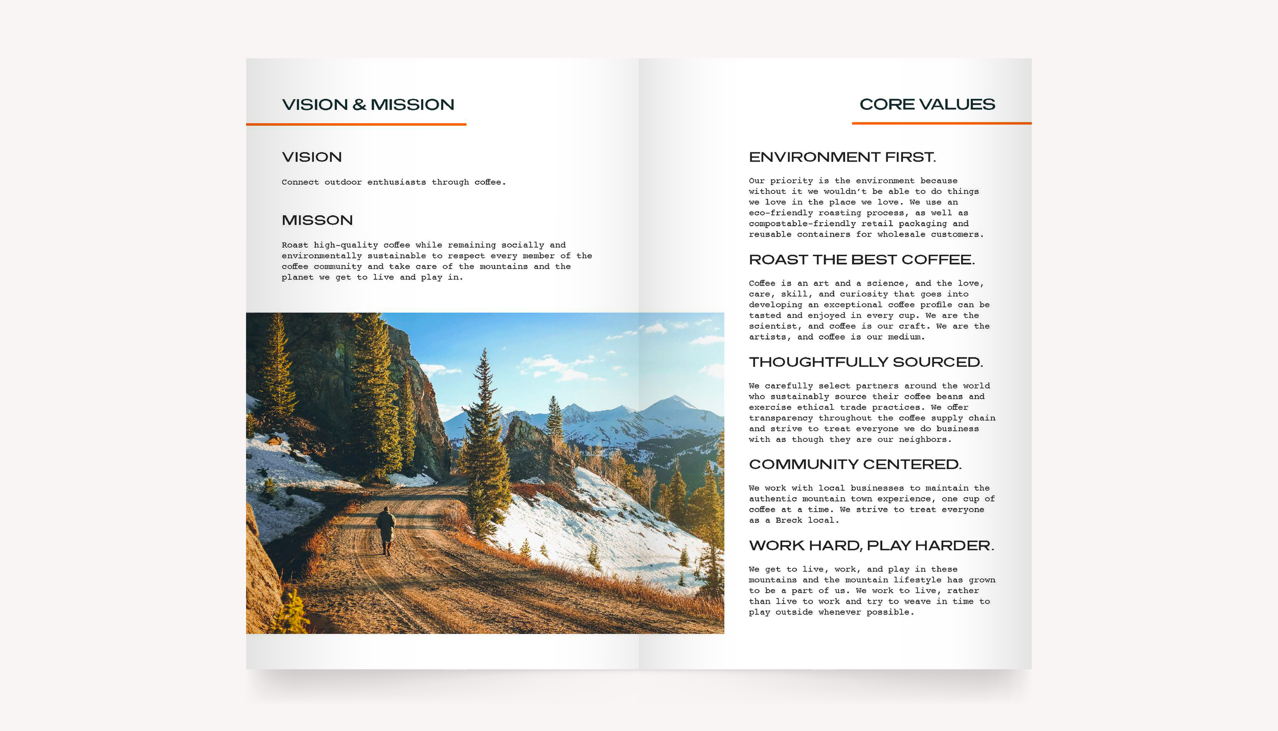
The strategic work started with a clear positioning exercise: defining who BCR is, who they're not, and who they're talking to. BCR is Colorado, eco-conscious, adventurous, local, honest, inclusive, creative, fun, and free-spirited. They are decidedly not elitist, serious, mass-produced, or mainstream. That north star guided every decision that followed.
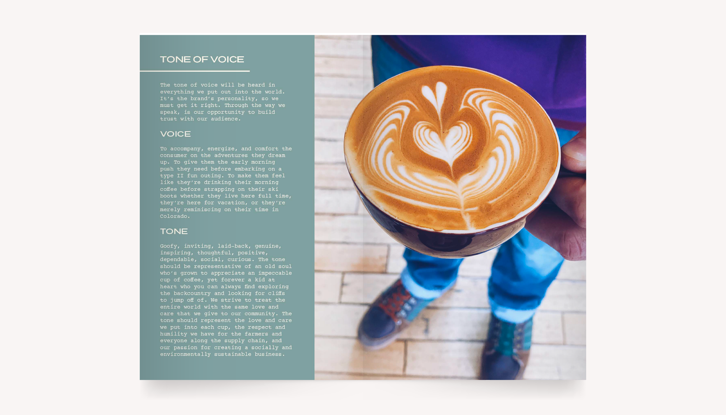
BRAND VOICE & MESSAGING
BCR's tone is goofy, inviting, laid-back, genuine, inspiring, thoughtful, positive, dependable, social, and curious. It's the voice of an old soul who's learned to appreciate an impeccable cup of coffee, but who you'll still find hiking in the backcountry on a powder day and jumping off whatever cliff looks fun.
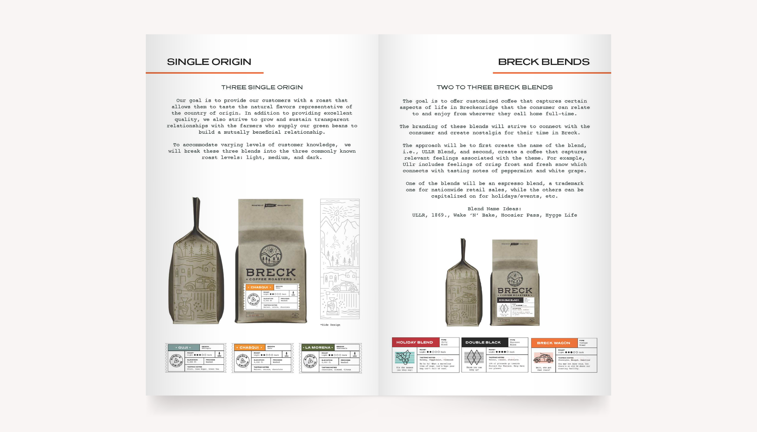
PRODUCT LINE & PACKAGING STRATEGY
A major portion of the brand work addressed BCR's growing product portfolio — five distinct lines, each needing its own identity within the broader BCR brand family:
Single Origin — Three roasts (light, medium, dark) showcasing natural country-of-origin flavors, with transparent sourcing relationships at the center of the story.
Breck Blends — Customized blends named after Breckenridge landmarks and culture (ULLR, 1869., Wake 'N' Bake, Hoosier Pass, Hygge Life), each with tasting notes tied to the feeling of the name.
More Than Coffee — A social impact line where each limited-edition release raises funds for a specific cause, with project storytelling built into the packaging.
Roaster's Choice — A top-shelf, limited-batch line for experimental and high-complexity roasts, positioned as the collector's tier of the BCR range.
Wholesale & Bourbon/Rum Coffee — Bulk offerings for local hospitality partners and 700ml Oslo glass bottle co-branded products with Breckenridge Distillery.
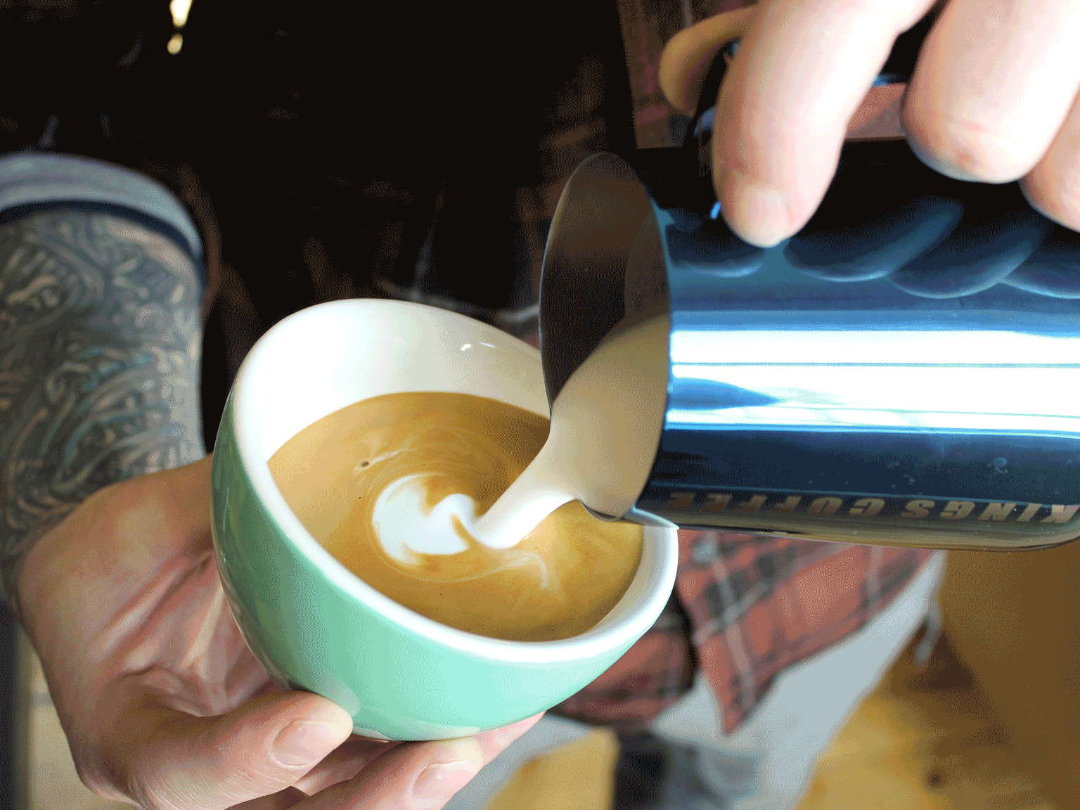
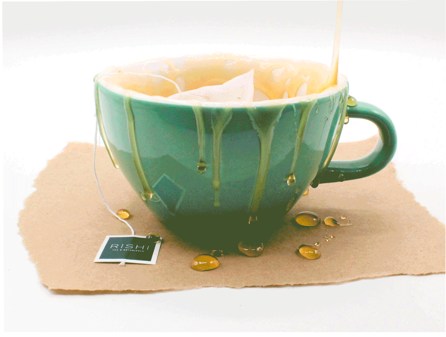
VISUAL IDENTITY & PHOTOGRAPHY DIRECTION
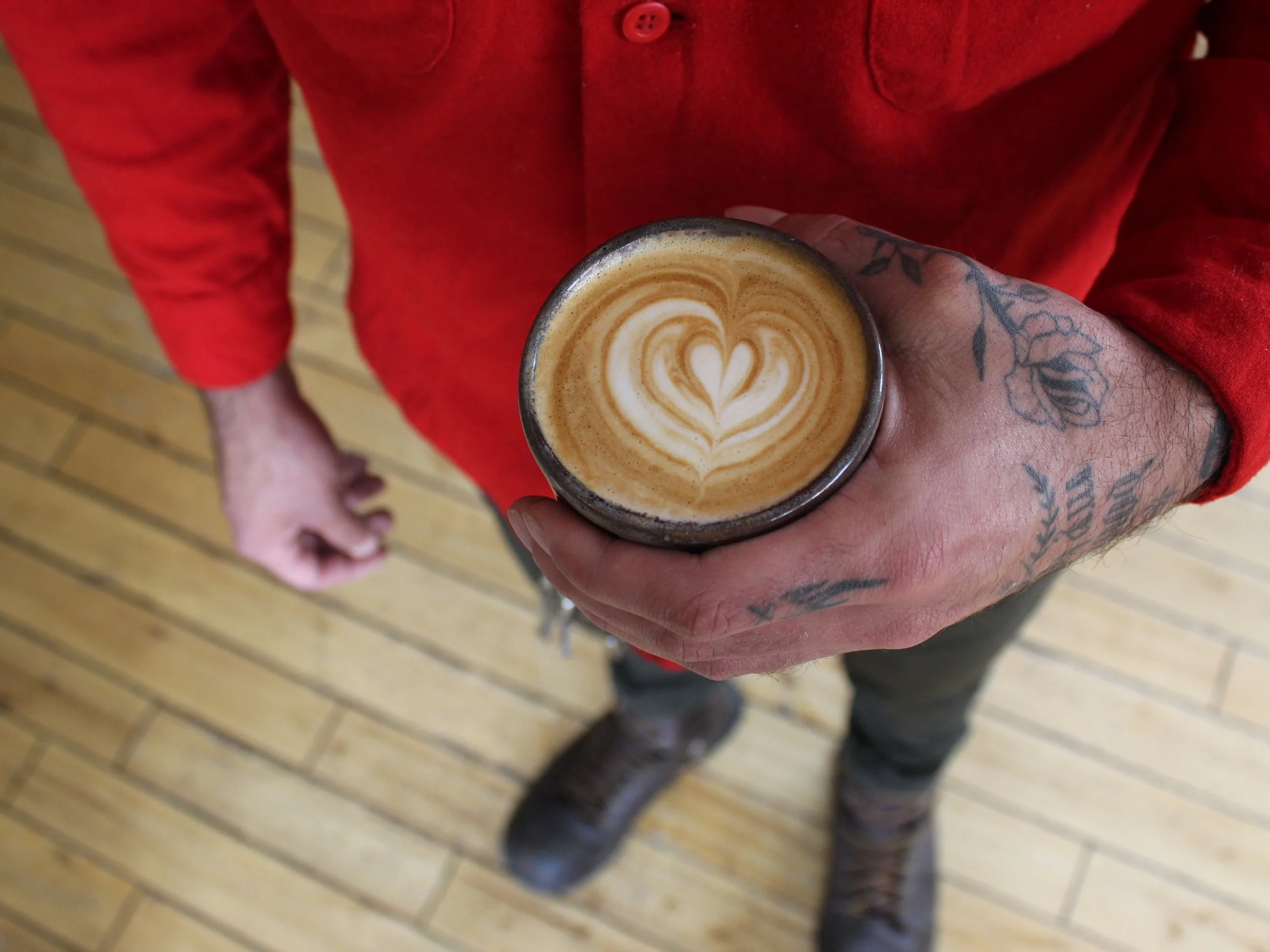
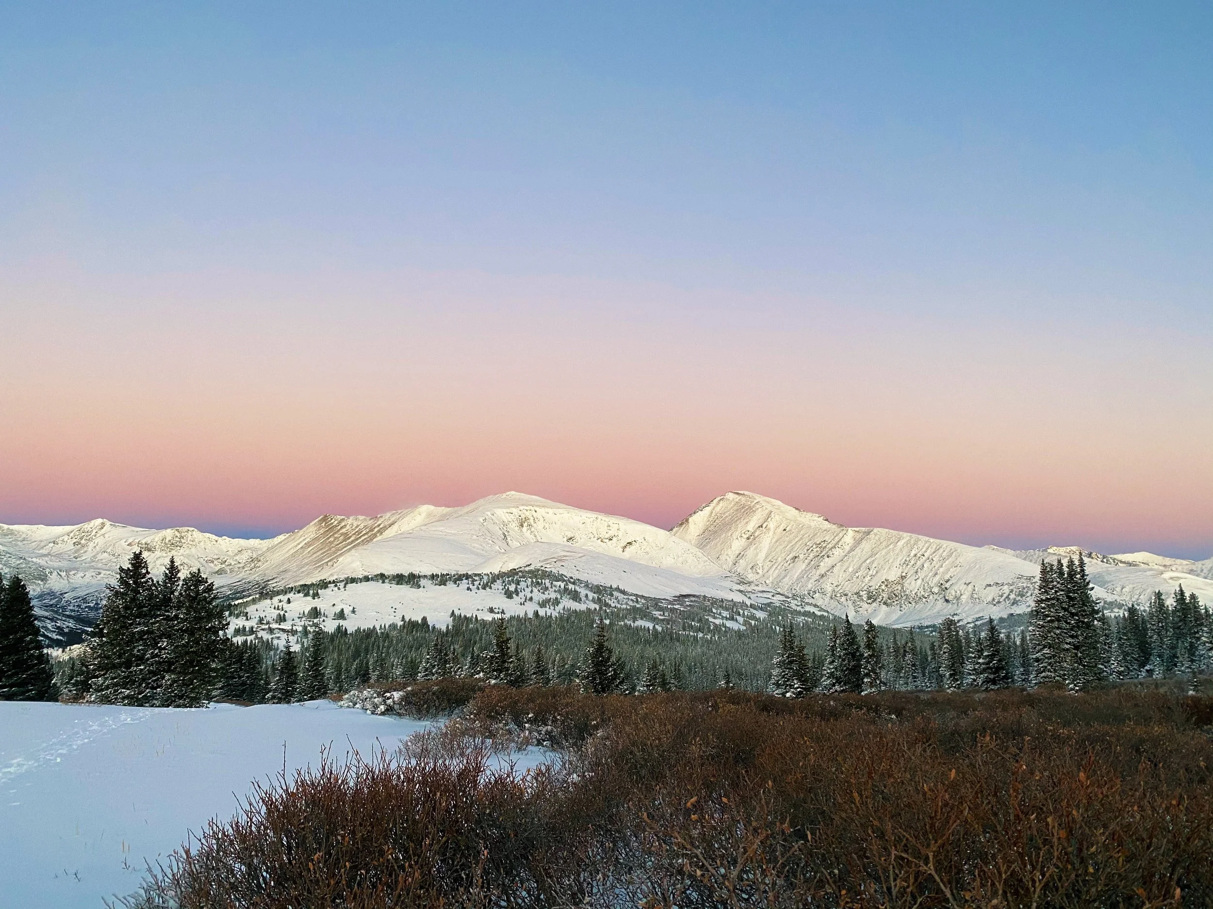
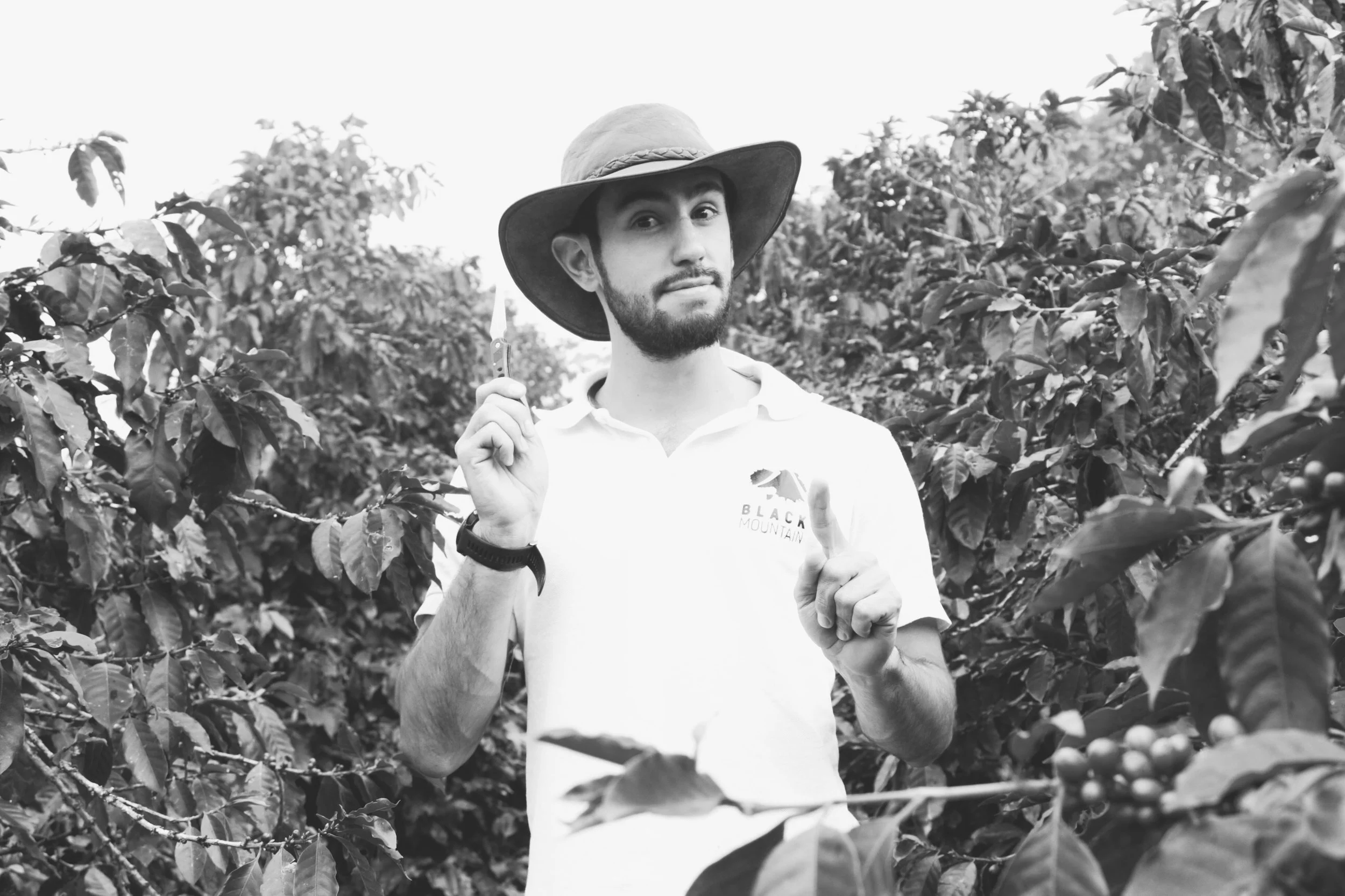
BCR's visual world lives in five categories: action, lifestyle, landscape, product, and portraits. The photography approach is bright, light, natural, and minimal on filters — never staged or posed, always capturing the adventure through nature. The balance is between tight detail shots and wide landscapes, with ample negative space and modest saturation.
Social media content was mapped across eight distinct pillars: local community, Colorado outdoors, drinking coffee in the wild, sustainability, farming communities, the science of coffee (roasting and cupping), the art of coffee (drinks and café vibes), and retail and merch. The Instagram handle @breckcoffee anchors the brand digitally, with creative direction inspired by accounts like @vervecoffee, @patagonia, and @stumptowncoffee.