Photo by Scott Webb
Grateful Living Medicine
COMPANY: Grateful Living Medicine
LOCATION: Colorado
INDUSTRY: Healthcare & Direct Primary Care
PROJECT:
Brand Identity & Strategy
Logo Design
Messaging
Website Design
Copywriting/SEO
Marketing Collateral
THE CHALLENGE
Holly and Julie built Grateful Living Medicine around a simple belief: healthcare should leave room for real human connection. Their direct primary care practice brings together women’s health, longevity, and whole-person wellness in Summit County, trading insurance red tape and rushed appointments for time, transparent pricing, and a doctor who actually picks up the phone.
The challenge was translating that approach into a brand that felt as personal as the care itself. GLM needed to communicate clinical expertise while capturing the warmth, individuality, and mountain-town soul at the heart of the practice. Patients needed to see both a physician they could trust and a person they could talk to (and actually wanted to!).
OUR SOLUTION
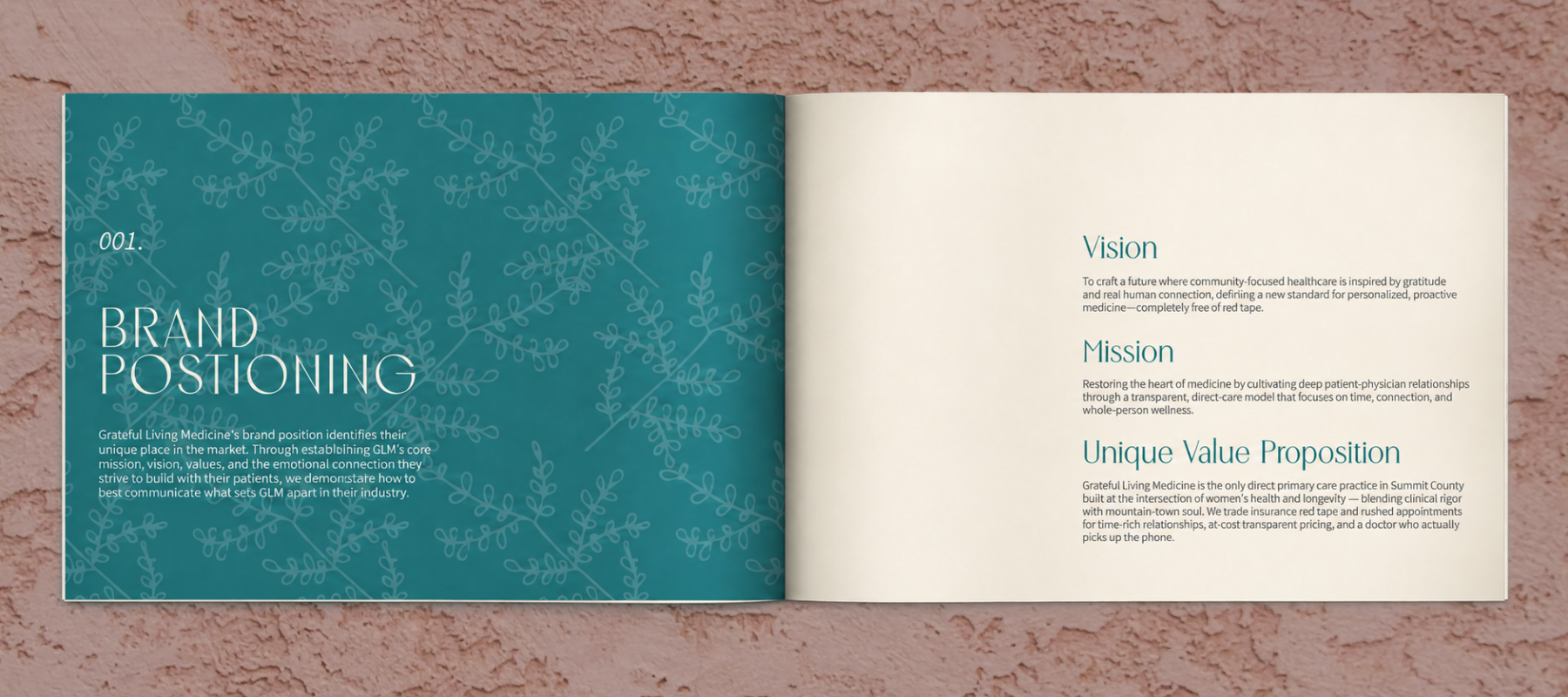
We began by defining what makes Grateful Living Medicine different: a commitment to restoring the heart of medicine through deep patient-physician relationships. That foundation informed the brand’s vision, mission, unique value proposition, values, audience positioning, and voice-and-tone framework.
From there, we developed an identity grounded in nature, gratitude, and the rhythms of Summit County life. Every element—from the language to the logo, colors, and imagery—was designed to make the practice feel welcoming and human, with the clarity and confidence patients expect from their healthcare team.
BRAND STRATEGY & POSITIONING
Grateful Living Medicine was positioned as the only direct primary care practice in Summit County built at the intersection of women’s health and longevity—blending clinical rigor with a down-to-earth mountain-town vibe. Its promise centers on time-rich relationships, at-cost transparent pricing, and direct access to a physician who knows you. Five values guide that promise: Transparency & Accessibility, Clinical Innovation, Mutual Respect, Intentional Gratitude, and Authentic Connection. Together, they speak to Summit County locals ready for a more personal approach to healthcare, with women’s health and longevity anchoring a practice that welcomes kids, partners, and parents, too. The voice brings that positioning into everyday conversation: Collaborative & Approachable, Radically Transparent, Grounded but Funky, and rooted in Disruptive Dependability. Knowledgeable, candid, and relaxed, GLM sounds like a trusted medical neighbor—someone who listens closely, explains clearly, and makes decisions with you.
VISUAL STRATEGY & MARKETING COLLATERAL
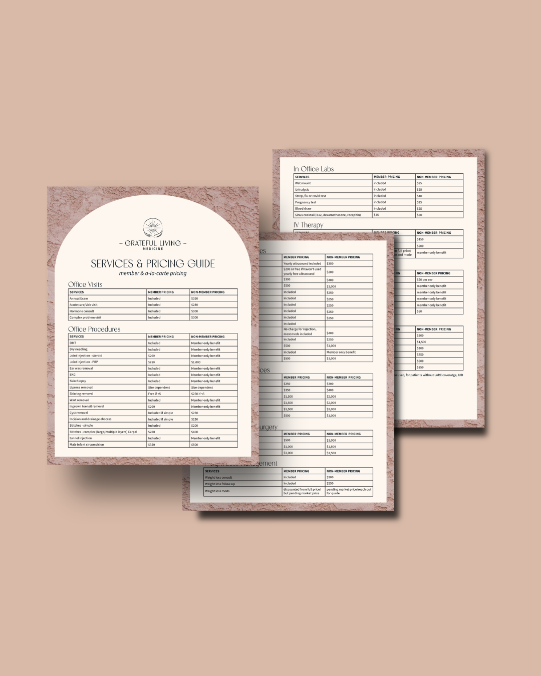
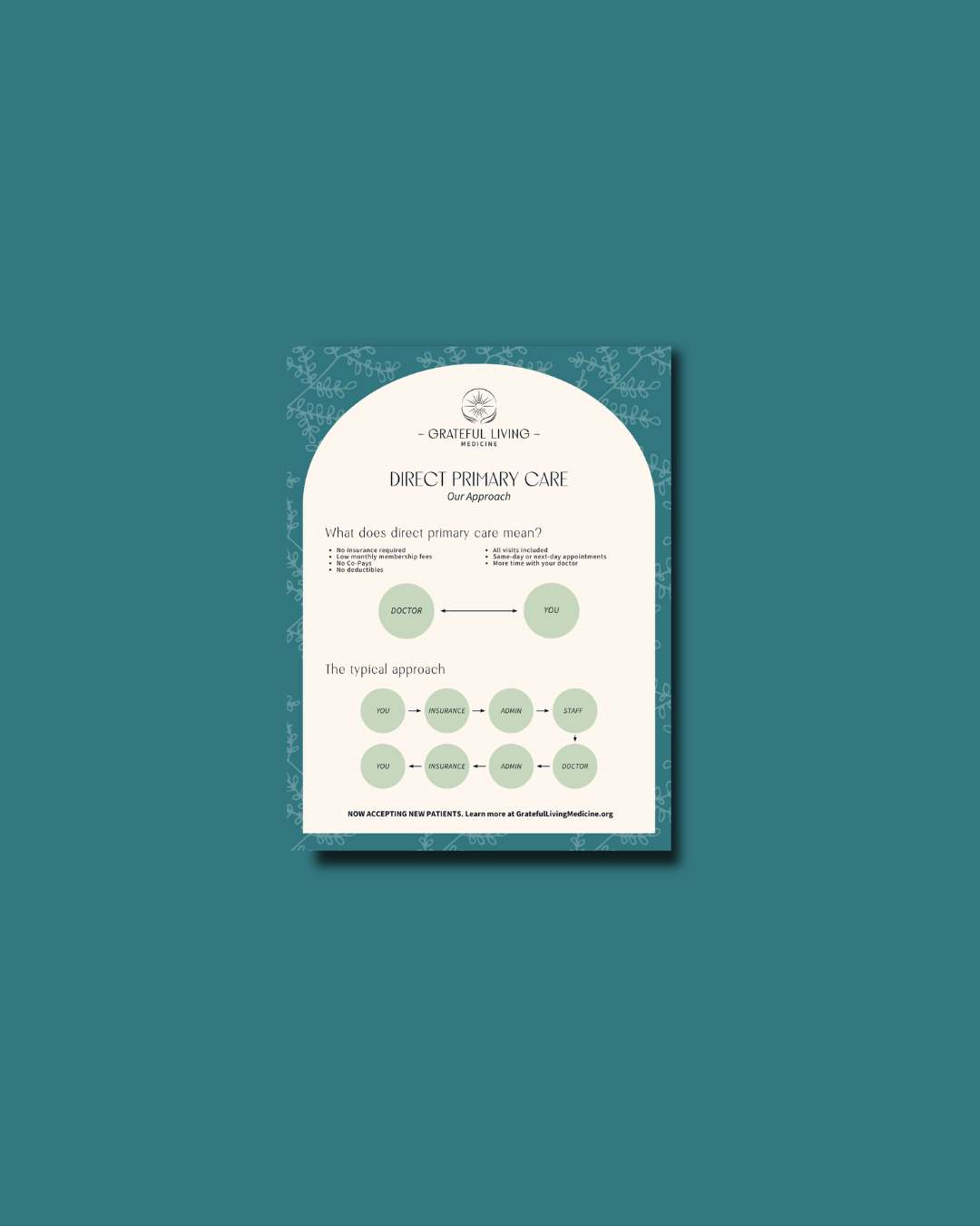
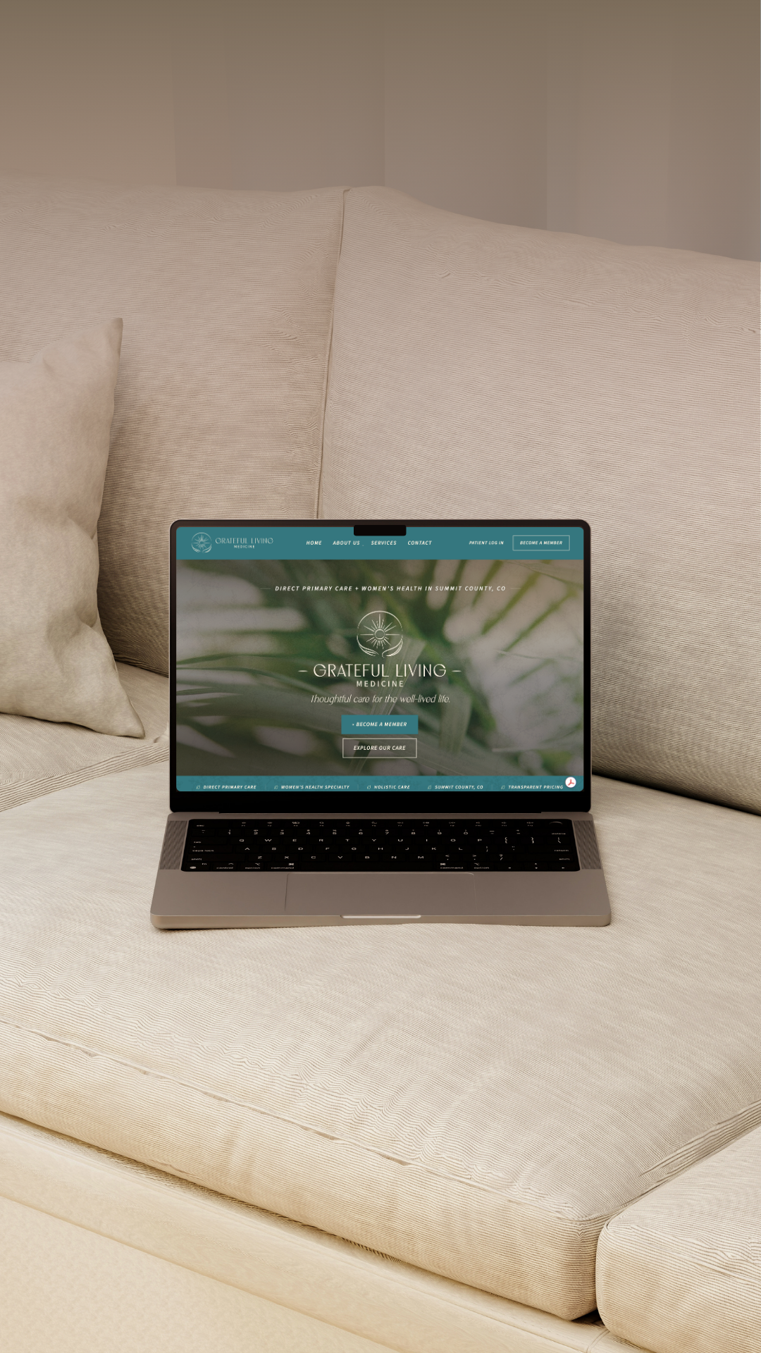
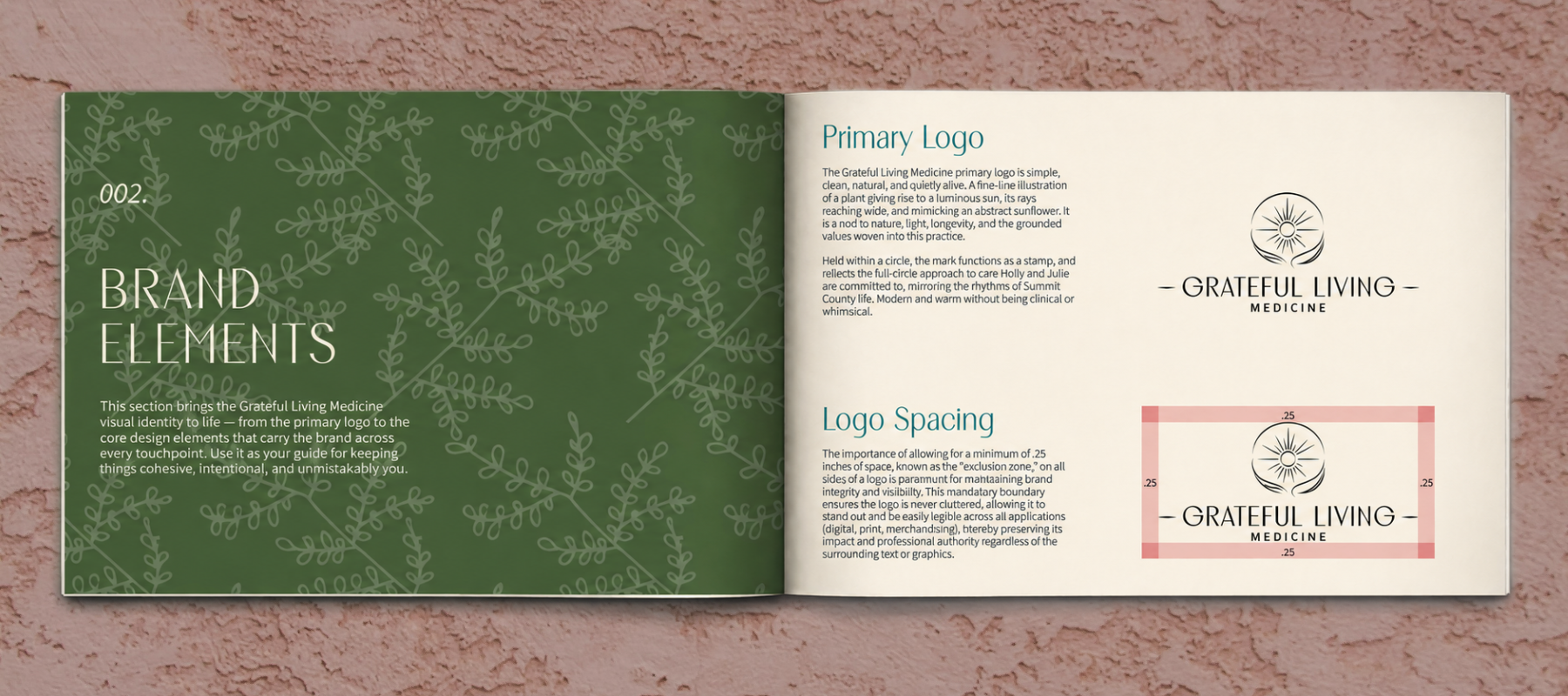
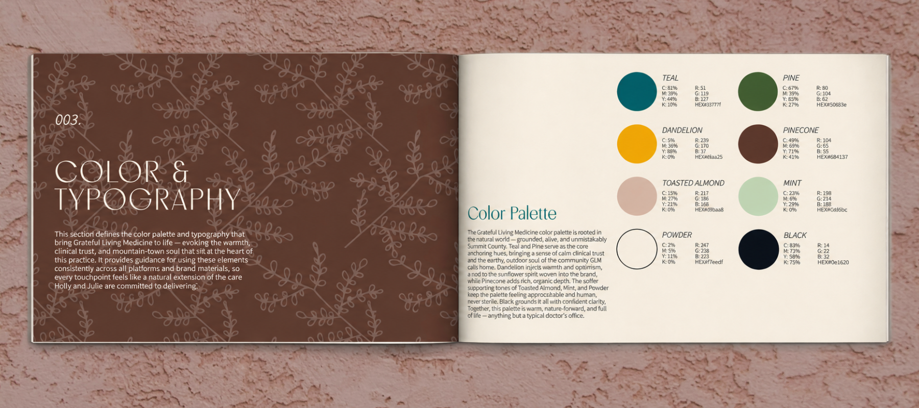
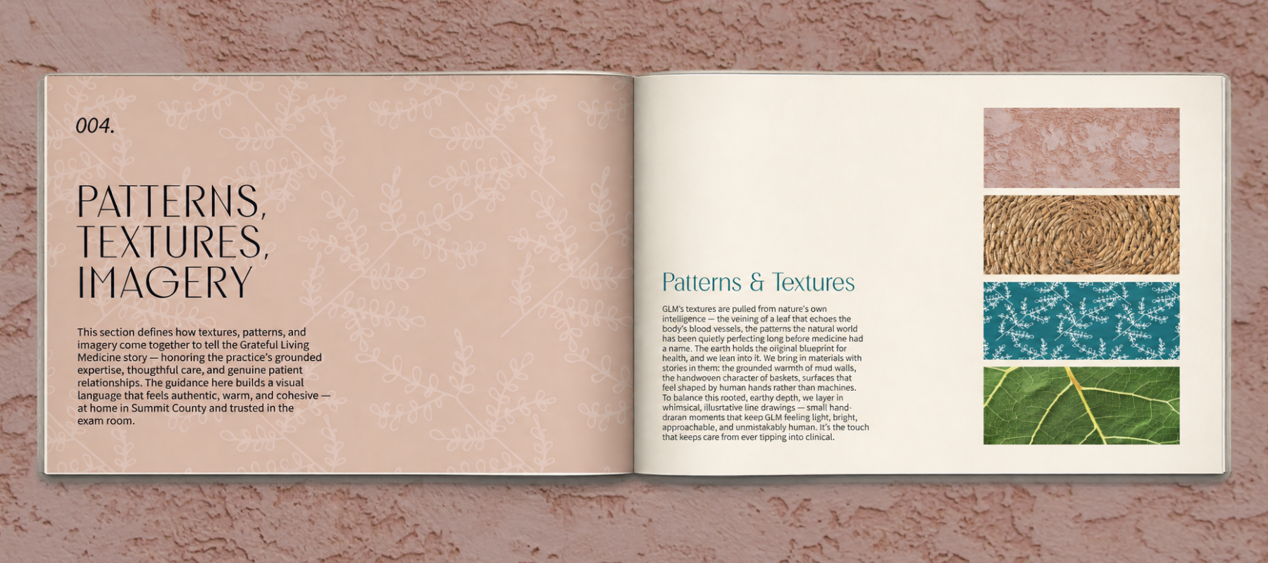
The primary mark—a fine-line plant rising into a rising/setting sun, held within a circle—sets the tone for a visual system rooted in nature, longevity, and whole-person care. A complementary brand mark and favicon pair with a palette anchored in Teal and Pine, with warm Dandelion and soft, earthy accents bringing the practice’s mountain-town vibe into focus. The typography leads with Romantic for headlines with an elegant, unhurried confidence, while Source Sans 3 keeps supporting copy clean, clear, and approachable. Nature-inspired textures, hand-drawn illustrations, and warmly lit imagery framed in squares and soft arches add a lived-in, personal quality. These elements were extended across business cards, website styling, a cost comparison guide, an Our Approach piece, and a services and pricing guide—ensuring every touchpoint communicates GLM’s clinical expertise, radical transparency, and genuine warmth.