Photo by Ian Keefe
Camilla Affelin Energy Coach
LOCATION: Aspen, Colorado
INDUSTRY: Health & Wellness
PROJECT:
Brand Identity & Strategy
Logo Design
Messaging

THE CHALLENGE
Camilla Affelin is an Energy Codes Coach, certified B.E.S.T. (Bio-Energetic Synchronization Technique) practitioner, and Remote Healing graduate of the Morter Institute — a woman who has helped clients dissolve long-held anxiety triggers in a single session and unlock momentum they had been chasing for years. Her lived experience is rich: moving to a new country, raising a daughter solo, navigating career pivots from award-winning food blogger to real estate to energy healer. Her toolbox is deep. Her results are real.
But when she was ready to step fully into her coaching practice, her brand didn't yet exist. The challenge wasn't just designing a logo — it was translating a genuinely multidimensional woman and a nuanced, often misunderstood modality into a visual identity that could earn trust instantly, communicate warmth without losing authority, and feel as expansive and alive as the transformation she facilitates.
OUR SOLUTION
We began where we always do: not in Canva, but in conversation. Through deep brand positioning work, we excavated Camilla's story, her methodology, her ideal client, and the transformation she delivers — before a single design decision was made. The brand needed to hold two essential truths simultaneously: the grounded wisdom of someone who has walked through her own fire, and the luminous openness of a guide who meets clients in their most vulnerable moments with curiosity instead of judgment.
The result is a brand that flows like water — intentional and fluid, structured and free.
BRAND STRATEGY & POSITIONING
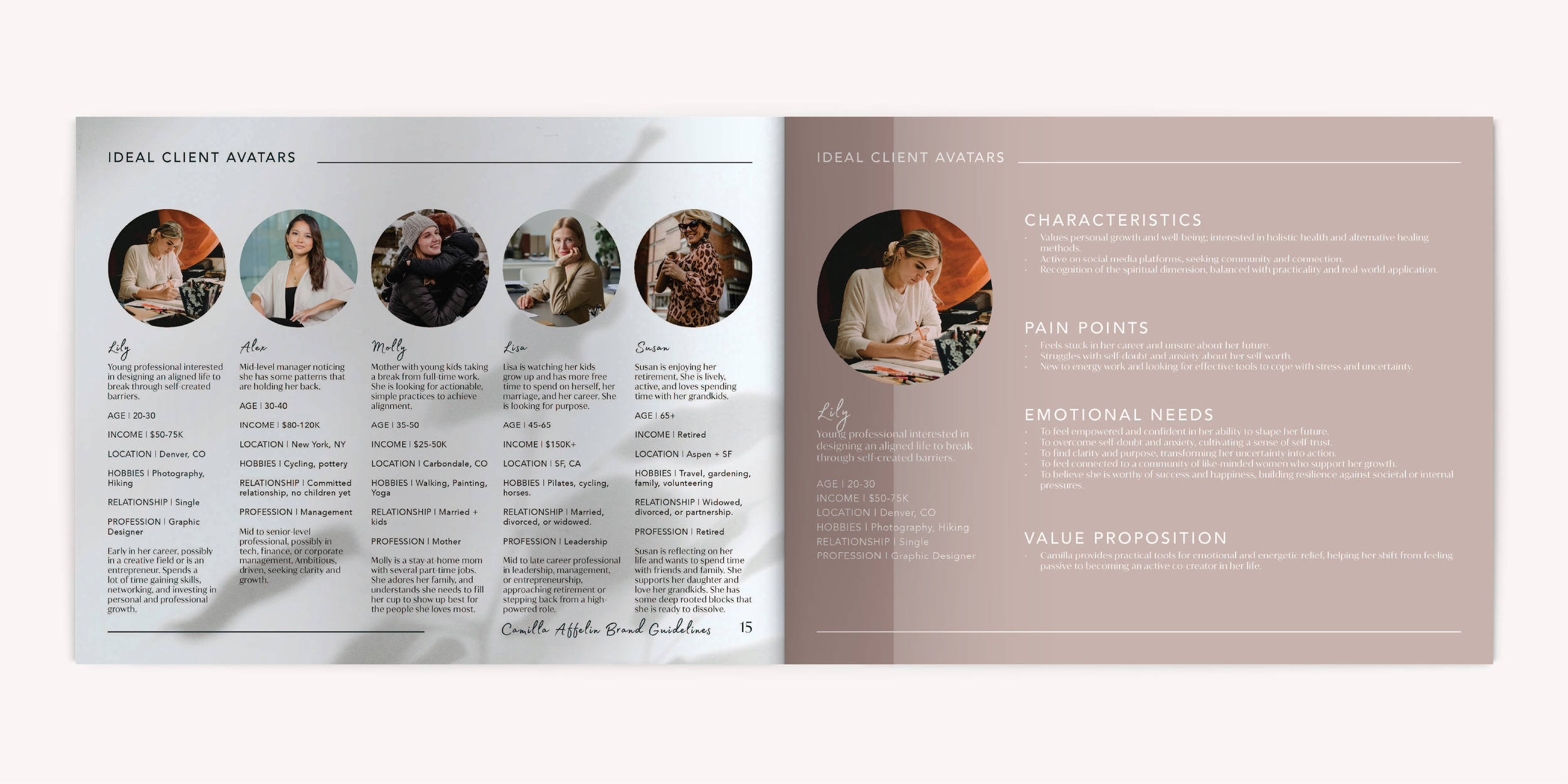
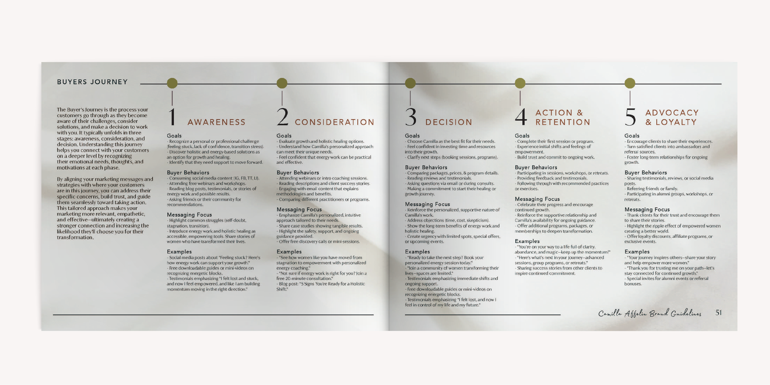
Camilla's positioning sits at a specific and uncommon intersection: she's not purely a life coach, and she's not purely an energy healer — she's both, at the same time, working in concert. Her UVP is that she combines intuitive healing with accountable action, helping clients build self-trust and take meaningful steps toward alignment. The shorthand we landed on: to ignite a healing ripple effect that transforms relationships — with oneself and loved ones, both past, present, and future. The ripple metaphor isn't just poetic — it reflects the actual mechanism of her work. One woman getting clear and aligned doesn't just change her life; it changes how she shows up in every relationship around her.
What separates Camilla in a crowded wellness market is the bridge she builds between deep healing and practical guidance. It's not insight without action. It's not release without direction. Clients leave sessions with both grounded energy and a clear sense of what's next — which is rare.
VISUAL STRATEGY & MARKETING COLLATERAL
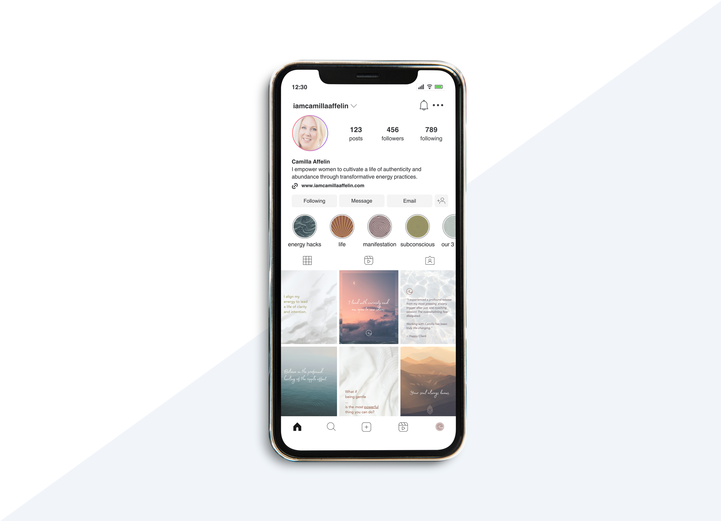
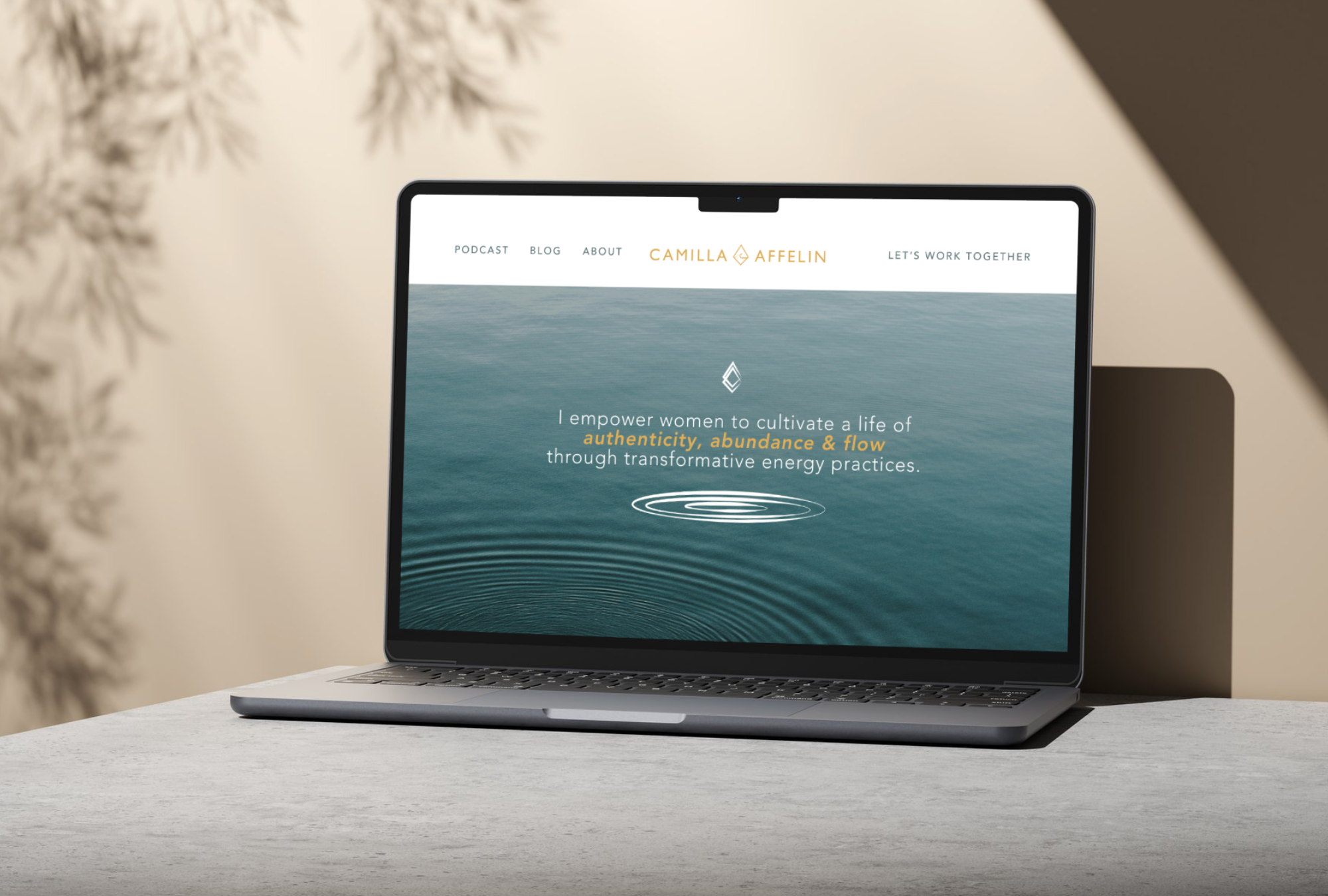
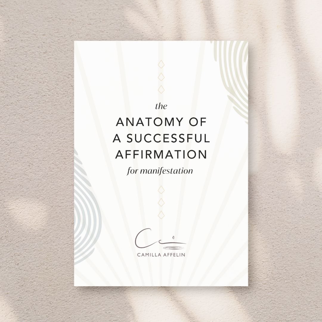
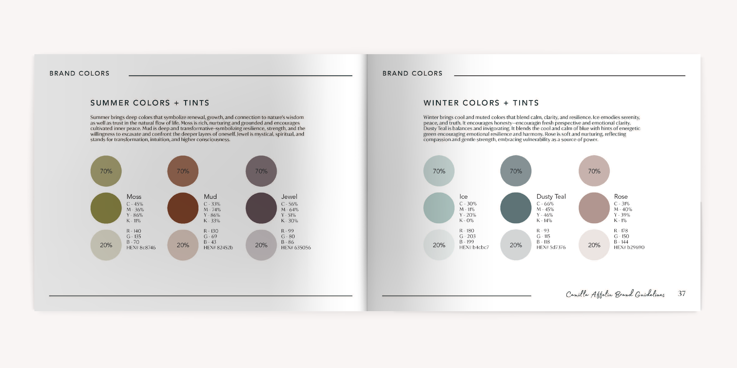
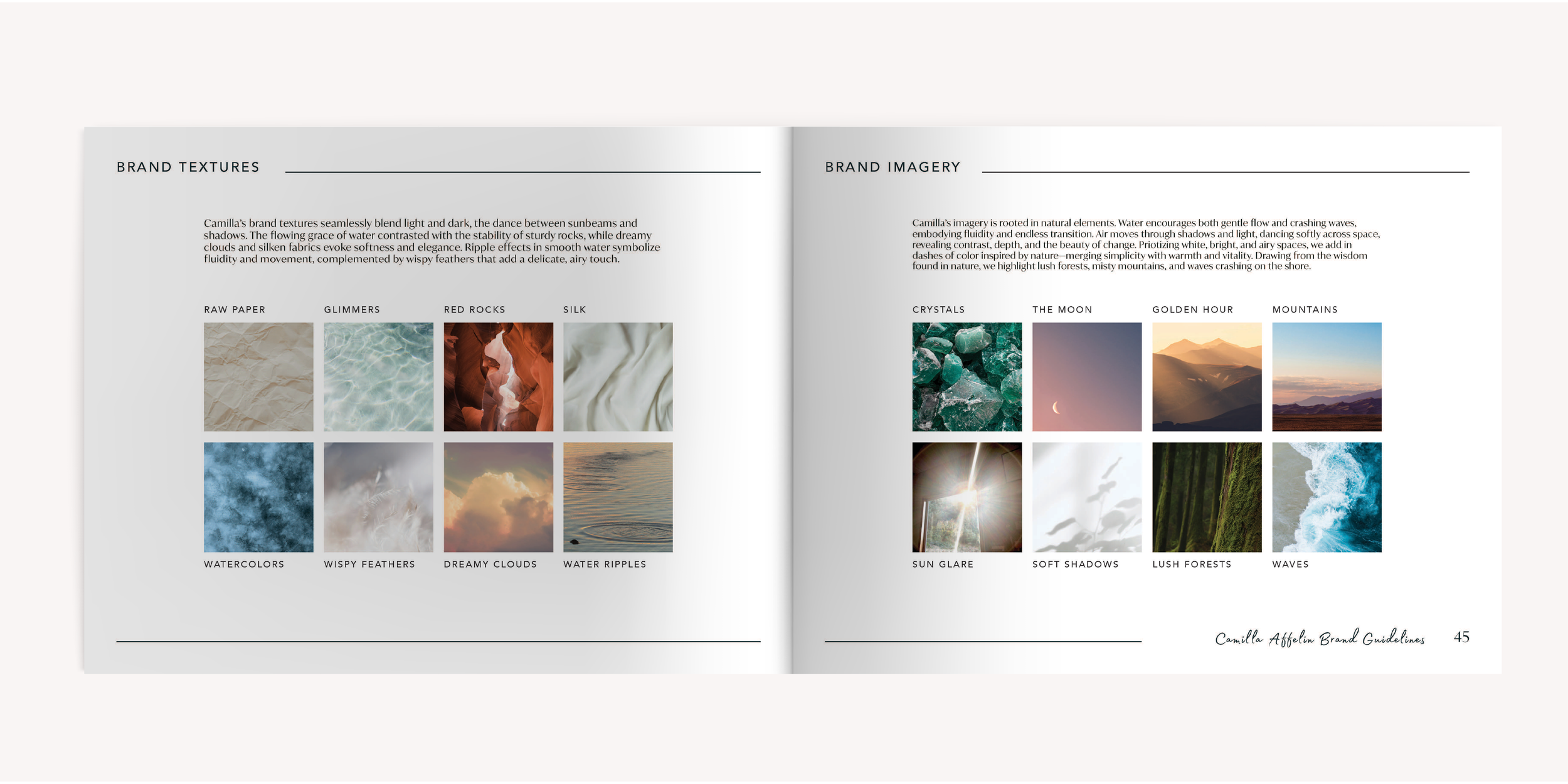
Every visual decision flows directly from Camilla's methodology — fluid, grounded, and luminous. The primary logo mark pairs a hand-drawn "CA" monogram with concentric ripple rings, turning her core philosophy into form, while a standalone diamond icon serves as a versatile secondary mark across a five-configuration logo suite. The year-round color palette combines Snow, Sand, and Gold anchored by deep Charcoal — bright and nurturing on the surface, with enough depth to honor the shadow work underneath. Seasonal palettes of cool Ice, Dusty Teal, and Rose (winter) and warmer earthy tones (summer) extend the system contextually. Typography pairs Avenir's clean structural authority in headlines with IvyMode's refined warmth in body copy and Madelyn Fill's flowing script for affirmations and personal voice moments — giving the brand range to flex from professional to intimate without losing cohesion. Photography is rooted in the natural elements at the heart of Camilla's work: water, light, earth, and air — crystals, golden hour, lush forests, soft shadows, and waves — always starting bright and airy, with drops of natural color layered in to create something that feels expansive, alive, and unmistakably hers.